Jack approached me to refresh the logo and branding for his growing business, LumberJack UK Tree Services. Although the company was relatively new, it was already building a strong reputation thanks to Jack’s expertise and commitment to high-quality customer service. The brief was to create a bold, professional identity that reflected this standard of work and could be confidently rolled out across staff uniforms, vehicle livery, and social media.

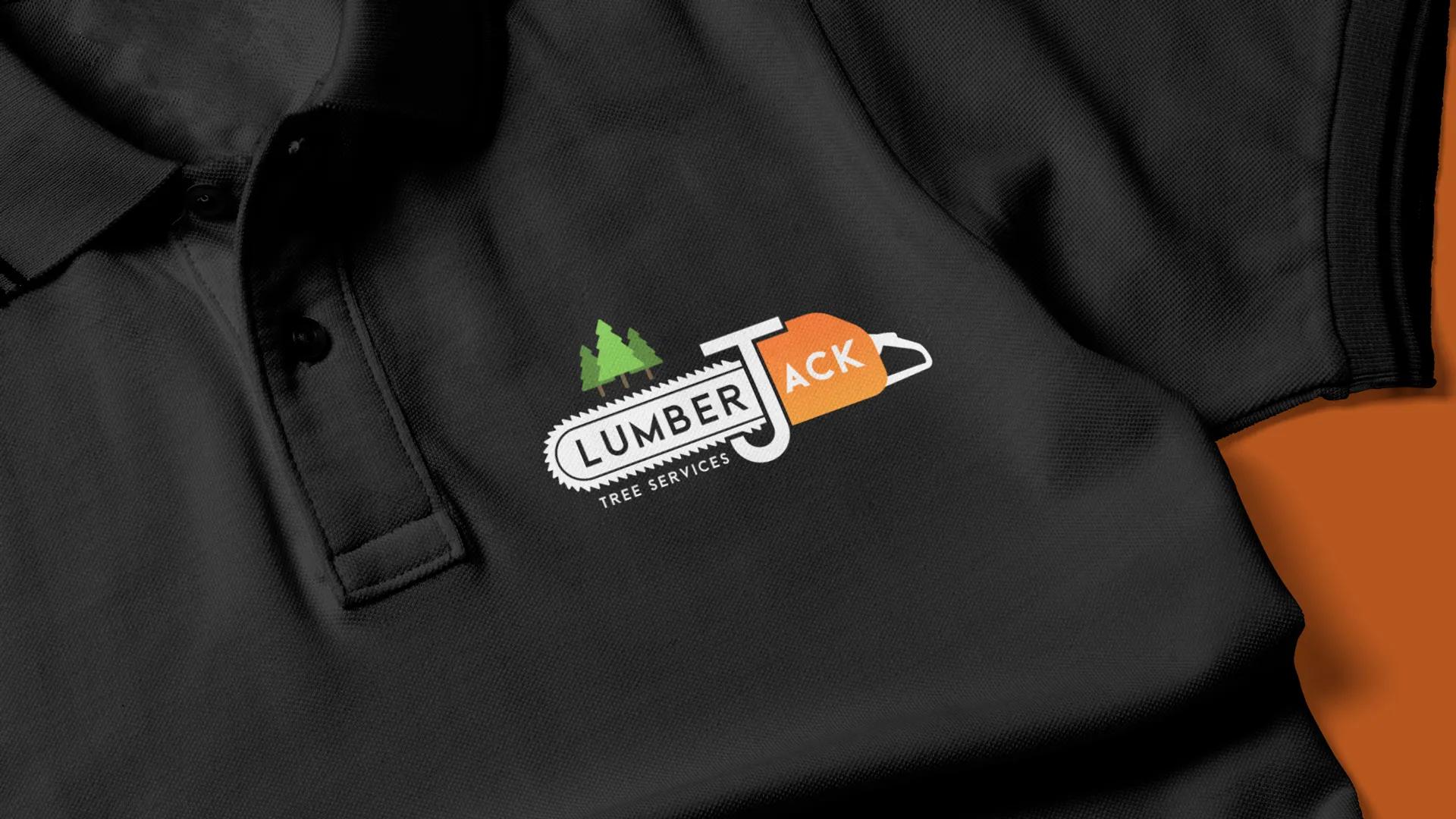
The name LumberJack immediately stood out to me as clever and full of potential, so the challenge was to create a brand that lived up to it rather than feeling generic. I explored the tools and equipment Jack uses day-to-day — chainsaws, axes, climbing gear — alongside natural elements such as trees and leaves. This led to the core idea of using a chainsaw as a central brand motif, with the handle cleverly adapted to form the ‘J’ in LumberJack. This approach allowed the logo to feel distinctive, relevant, and memorable while staying true to the nature of the work.

The final logo has a strong visual presence and a confident colour palette, combining vibrant orange with dark grey, light green, and white to create a professional, workman-like aesthetic. The branding translated well across physical and digital touchpoints, from uniforms to vehicle graphics. To further bring the brand to life, I also produced an animated version of the logo for use as a video intro on LumberJack’s YouTube channel, helping reinforce brand recognition across content and platforms.