2021
2021 UI/UX design
Background
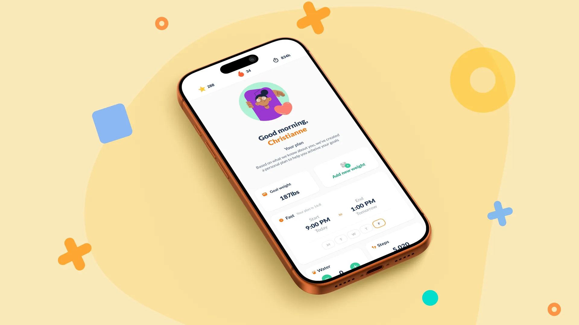
Fastic’s dashboard needed to do a better job of surfacing the information users cared about most, while feeling more personal, focused and useful day to day. The opportunity was to evolve the experience without creating something that felt disconnected from the rest of the product.
The work
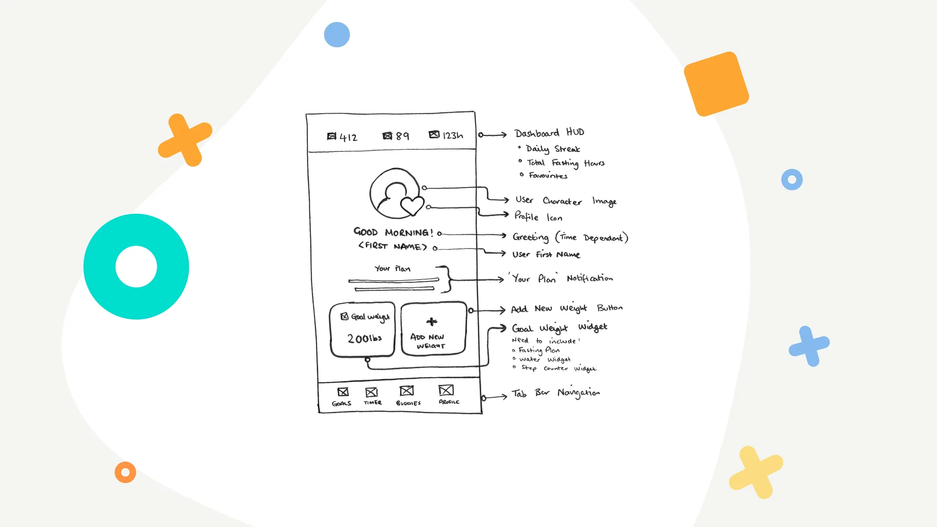
I translated the research into an initial dashboard wireframe before developing the final interface in Figma. The dashboard was designed as a flexible, component-based experience that could adapt around different users, goals and priorities.
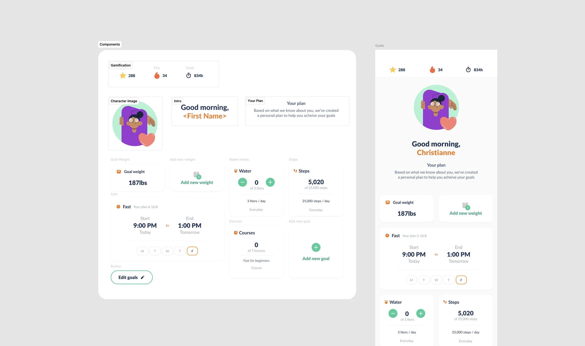
The result
The new dashboard was adopted and shipped quickly, helped by the simplicity of the UI and the reusable component structure. Because it stayed closely aligned with Fastic’s existing brand, the team could introduce the improvements without waiting for a wider redesign of the entire application.